Home
CASES
Identity development for the ticket sales service NUMOTAMO
Identity development for the ticket sales service NUMOTAMO
ABOUT THE PROJECT
NUMOTAMO is not just a ticket sales service, this is a digital bridge between your “I want to” and the real thrill. In this project we created this brand for those who are tired of endless scrolling through their feed and seek genuine emotions. The brand name combines two impulses: “Numo!” (a call to action) and “Tamo” (the place where the event happens).
Mission: To shorten the path from desire to the moment of emotional explosion.
VISUAL STRATEGY
Logo: A Digital Portal to Emotions
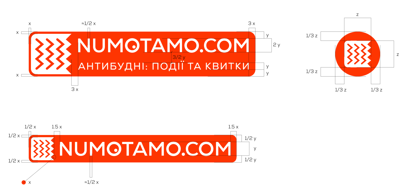
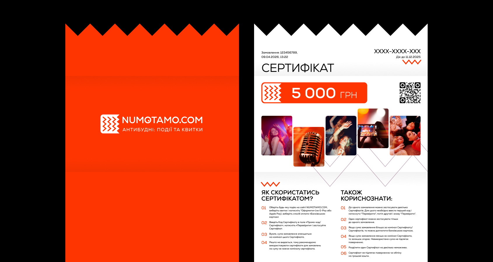
The NUMOTAMO logo is a visual embodiment of speed and emotional transformation. It is designed as a dynamic element that adapts seamlessly to any environment. Name and Meaning: The name combines two impulses: “Numo!” — a call to action, and “Tamo” — the place where the event happens. The logo visualizes this journey, shortening the distance between desire and emotion. The “Wristband” Shape: The rounded shape surrounding the logo — more than just a frame; it is a visual metaphor for a silicone event wristband or an admission ticket. It symbolizes the moment of transition: when a user puts the wristband on, they leave everyday life behind and step into the world of the event. The Digital and Physical Connection: The logo is designed to be identical to its physical representation on merchandise. When someone sees the icon on their smartphone, they subconsciously recognize the same shape they will later receive at the entrance to a fan zone, theater, or other event venue. Graphic Symbol: The graphic element (the zigzag) represents the rhythm of events, the pulse of the city, and the energy that cuts through everyday routine.
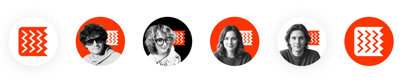
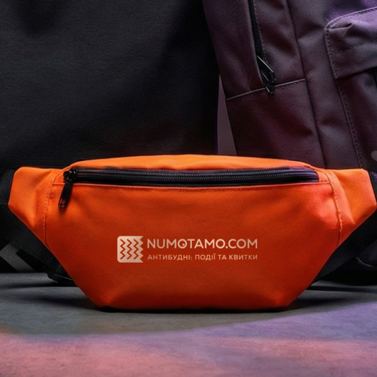
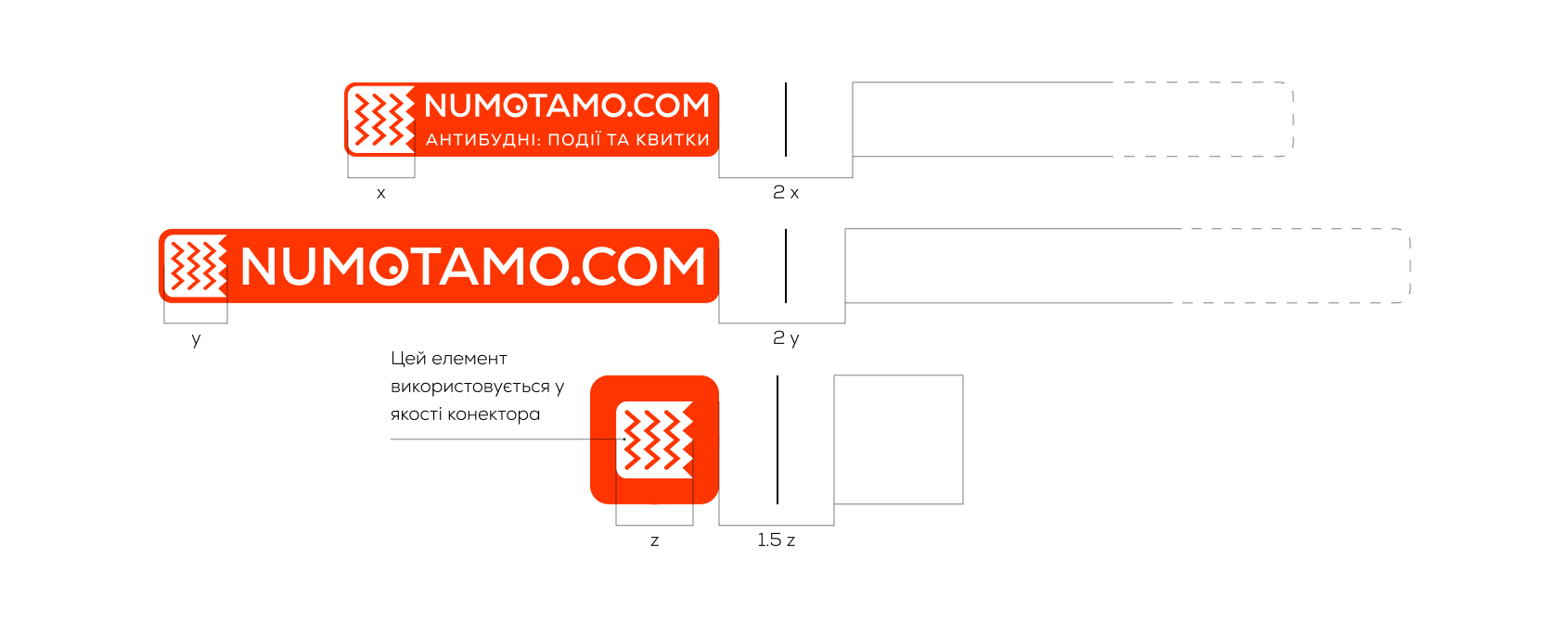
Anatomy and versions Basic version: It is a text writing within a rounded block, which is an integral part of the logo. The only exception to using it without a frame is when the background is identical in color to the block itself. Full version: Contains the descriptor “ANTI-BUGNY: EVENTS AND TICKETS”, which clearly communicates the brand’s niche. Monochrome and inversion: For work on complex backgrounds or in print, black and white versions and a color inversion of the sign are provided. Favicon and icon: A minimalist sign (zigzag in a die) is used for compact formats, such as a website favicon or an avatar on social networks.
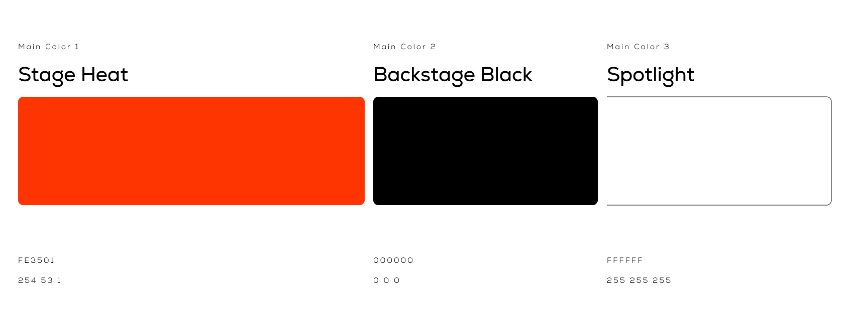
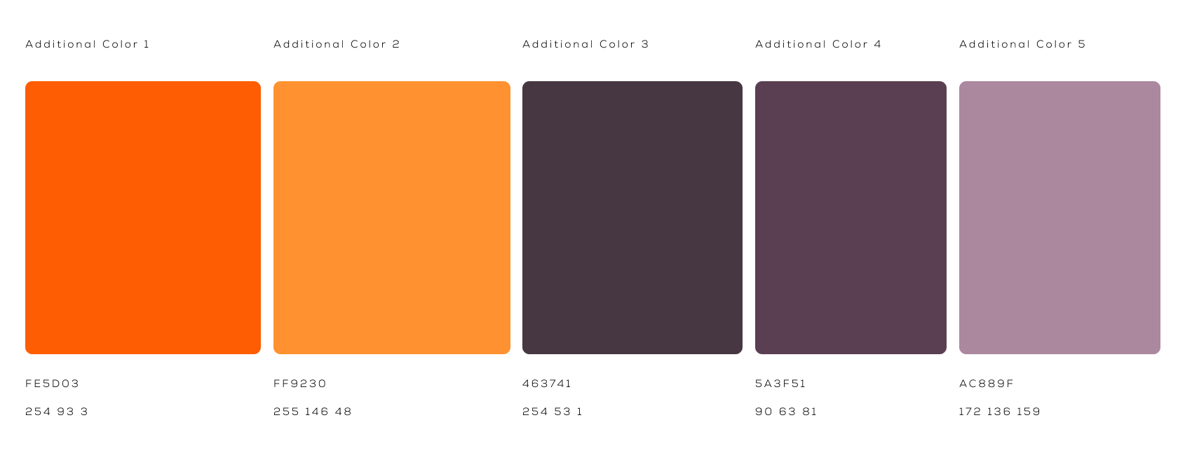
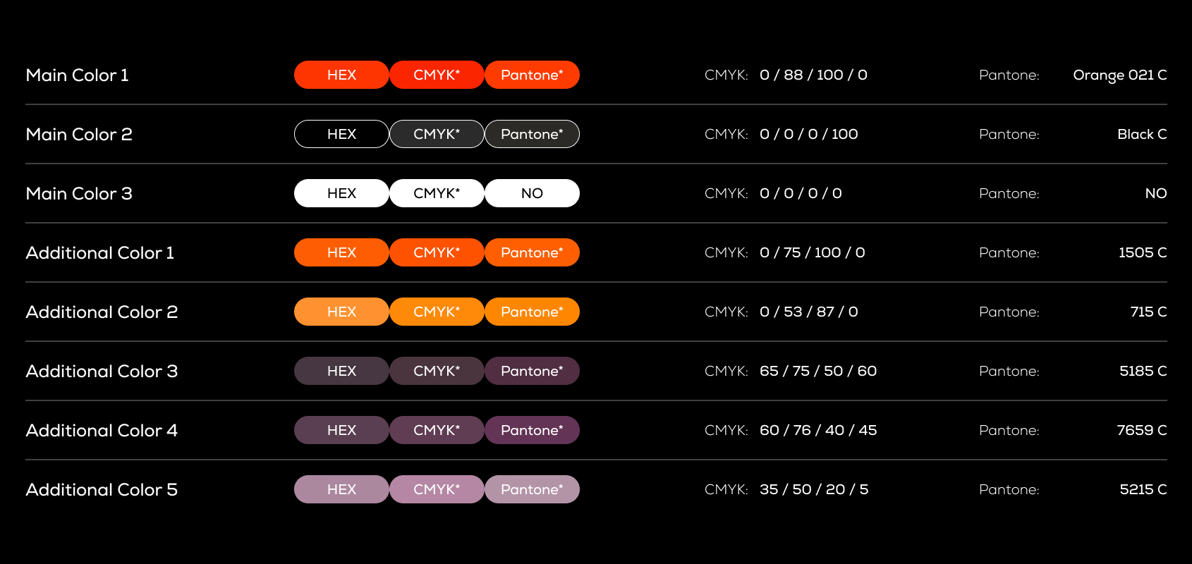
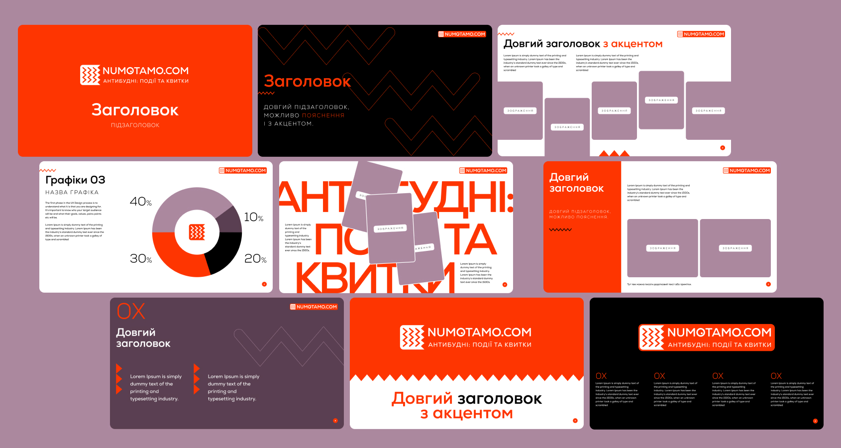
Color The dominant orange #FE3501 (Stage Heat) combined with the deep black #000000 (Backstage Black) give the energy of the stage that cuts through the darkness of the hall.
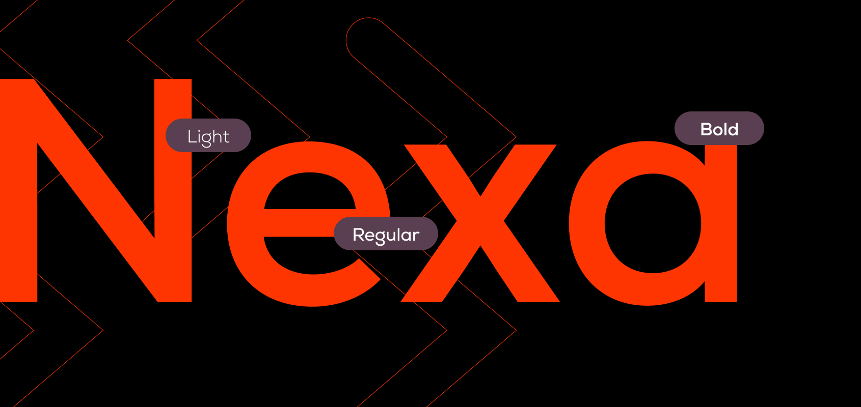
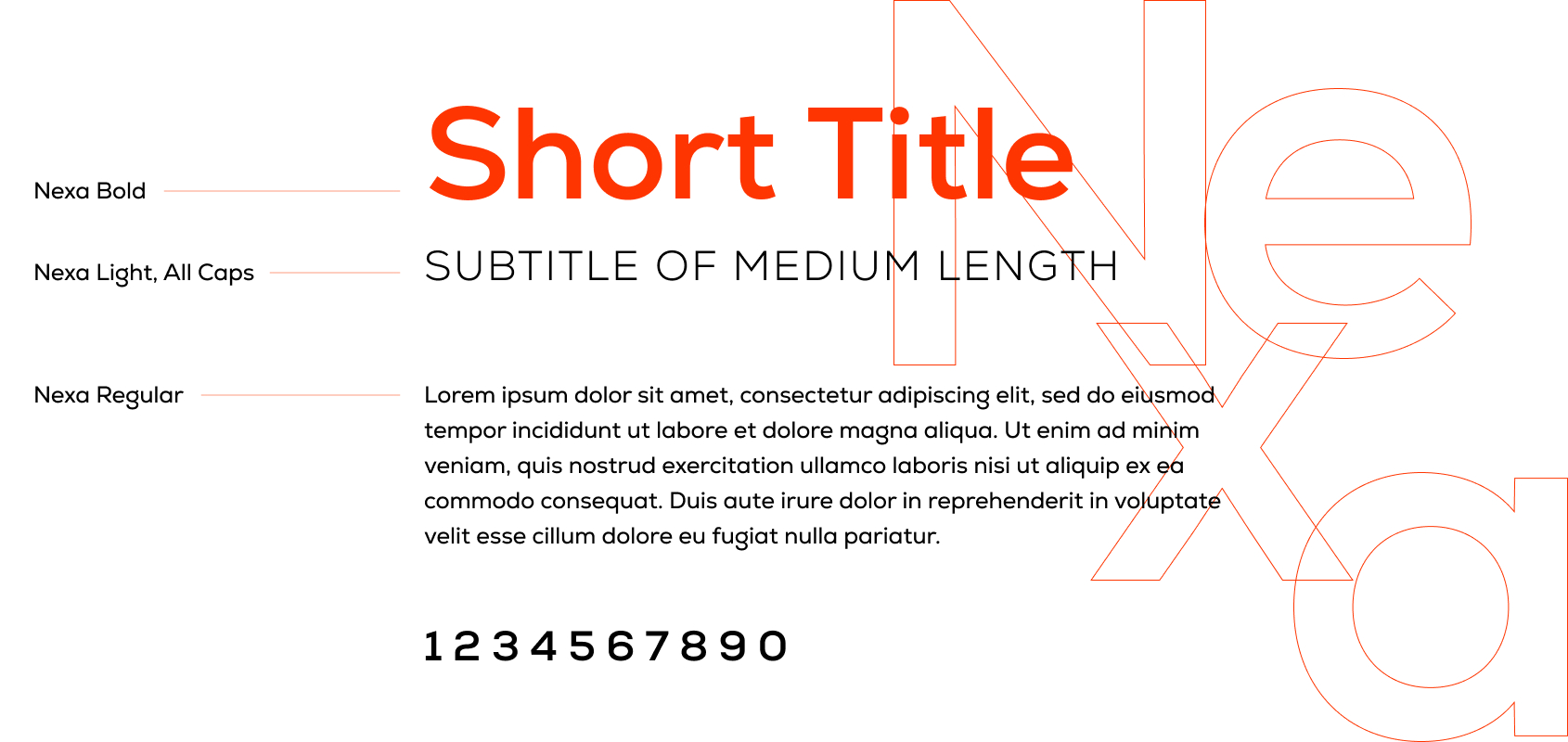
Typography The Nexa font — geometric, clean and technological, emphasizing the reliability of our “digital cash register”.
ECOSYSTEM AND MERCH
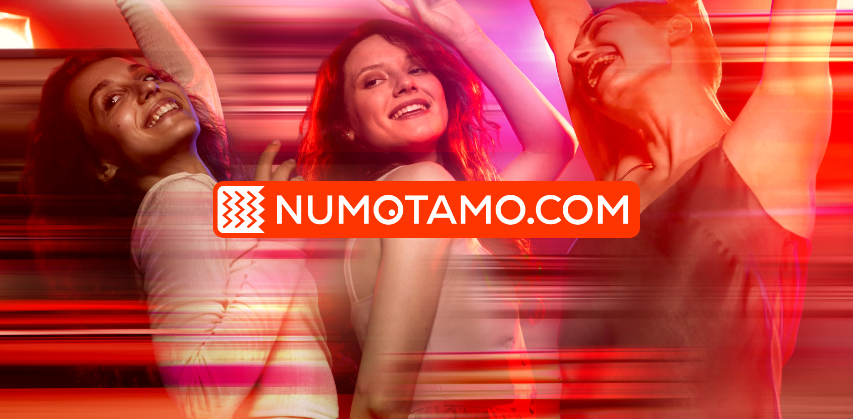
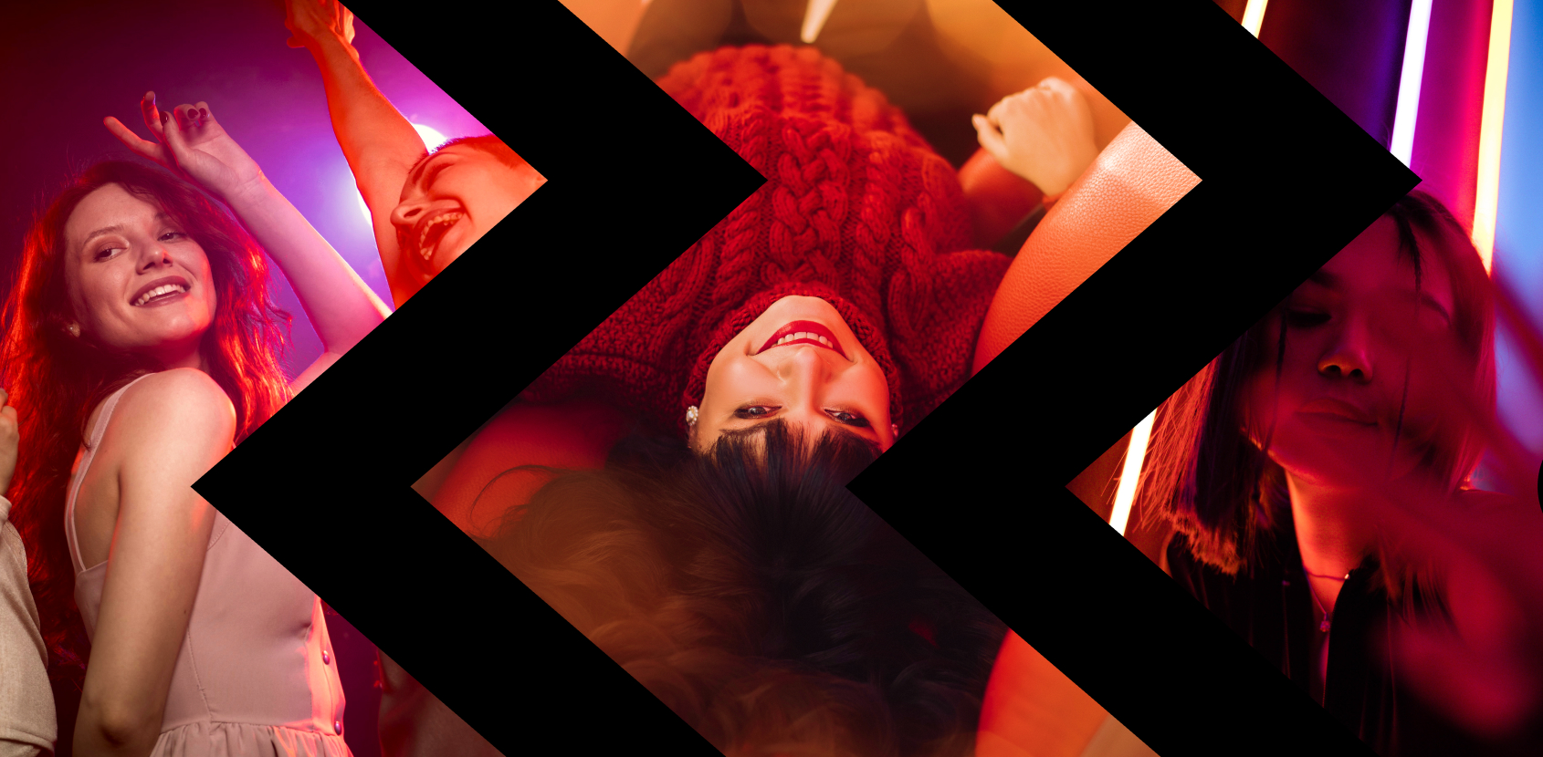
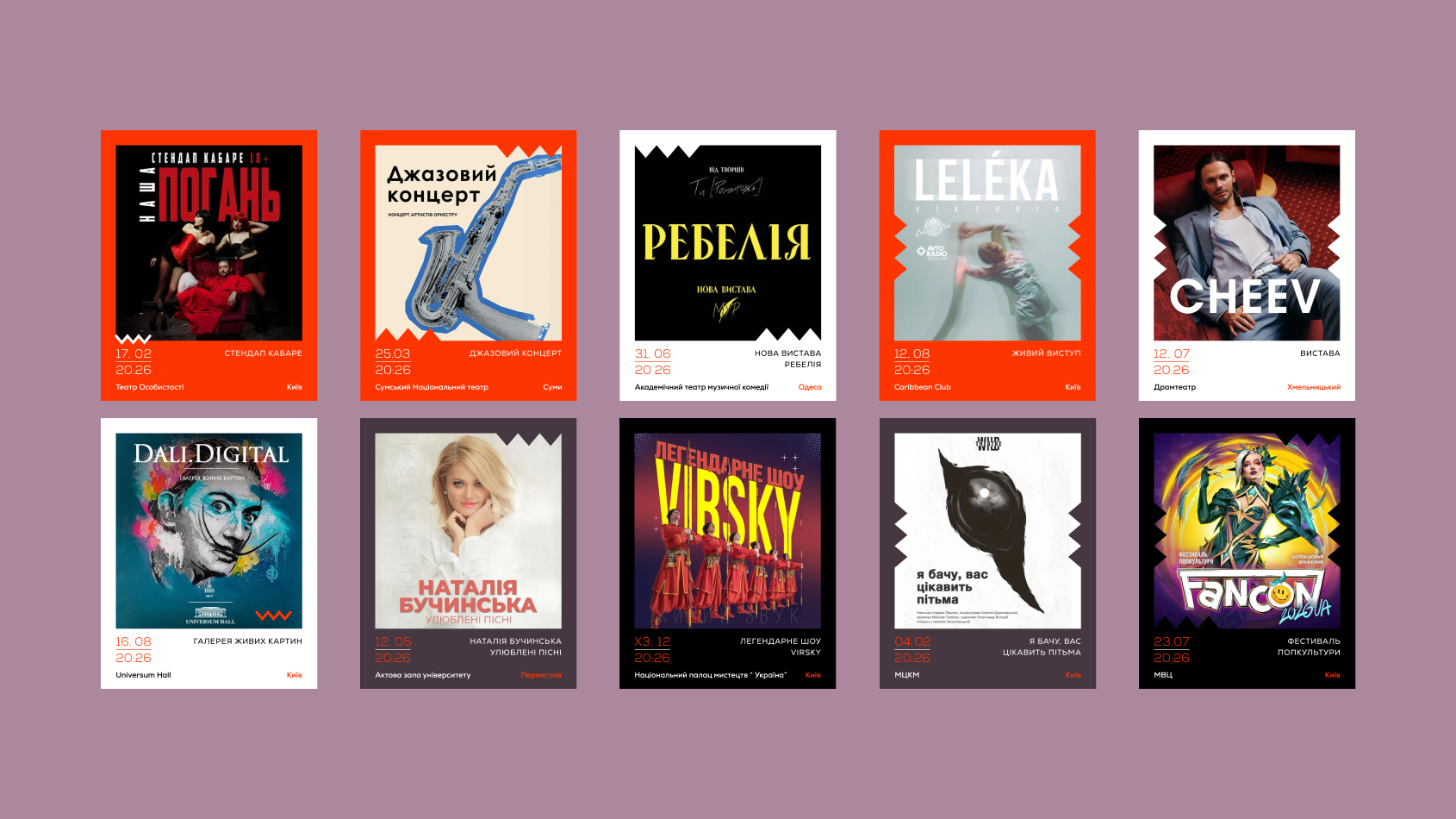
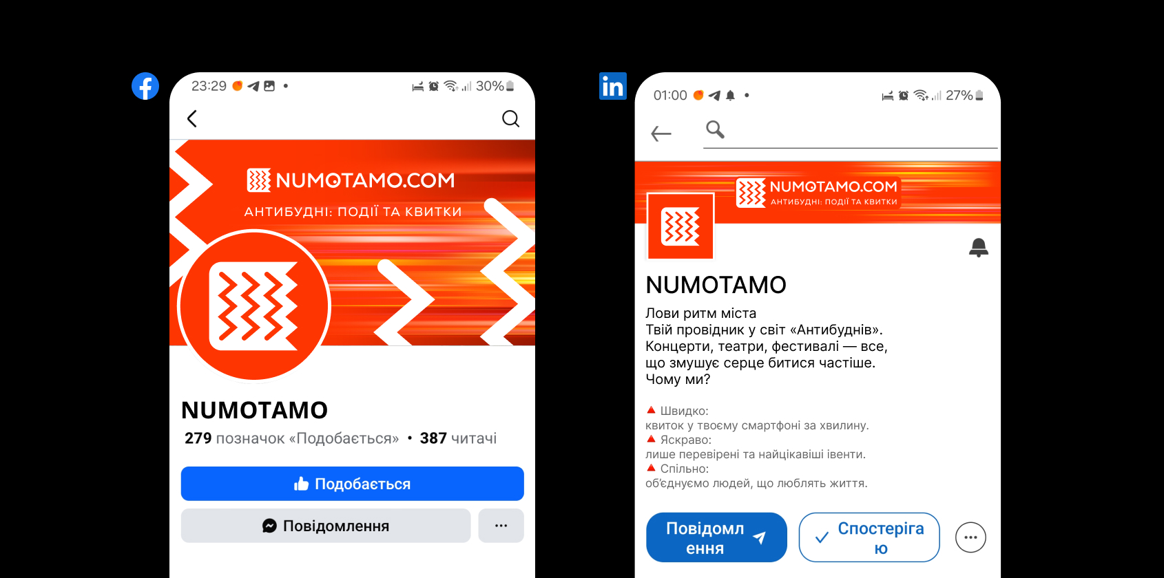
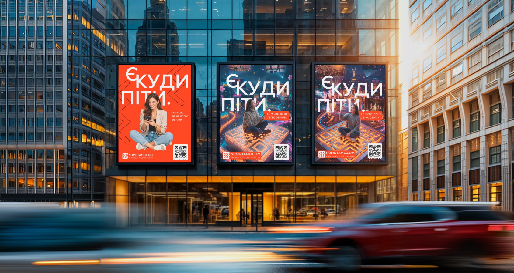
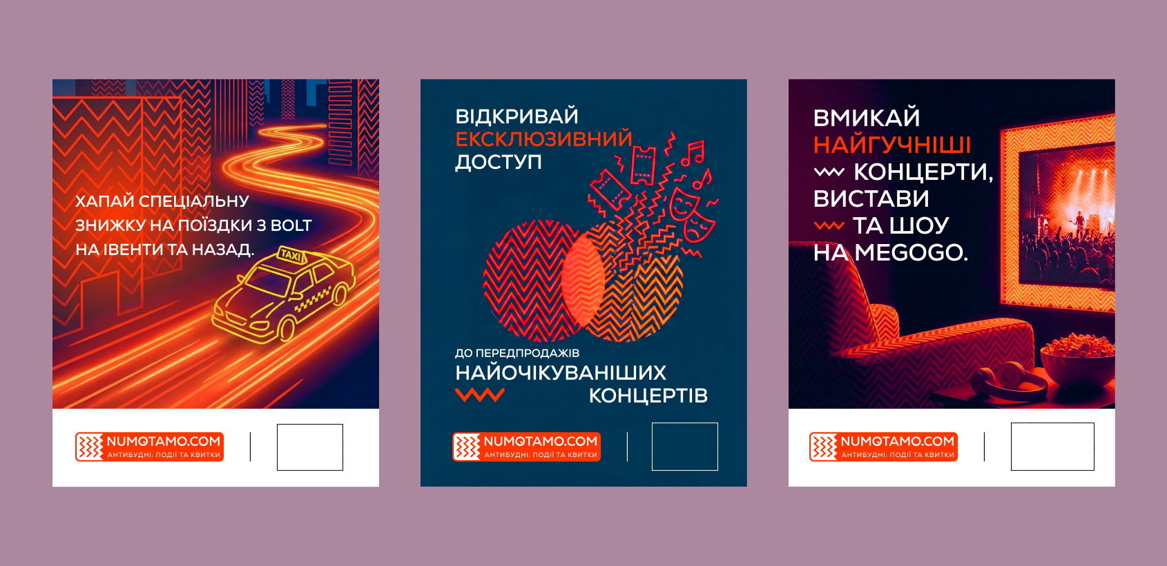
Social Media Dynamic layouts for Stories and Reels are built so that the content remains in the spotlight, without being overshadowed by the network interface.
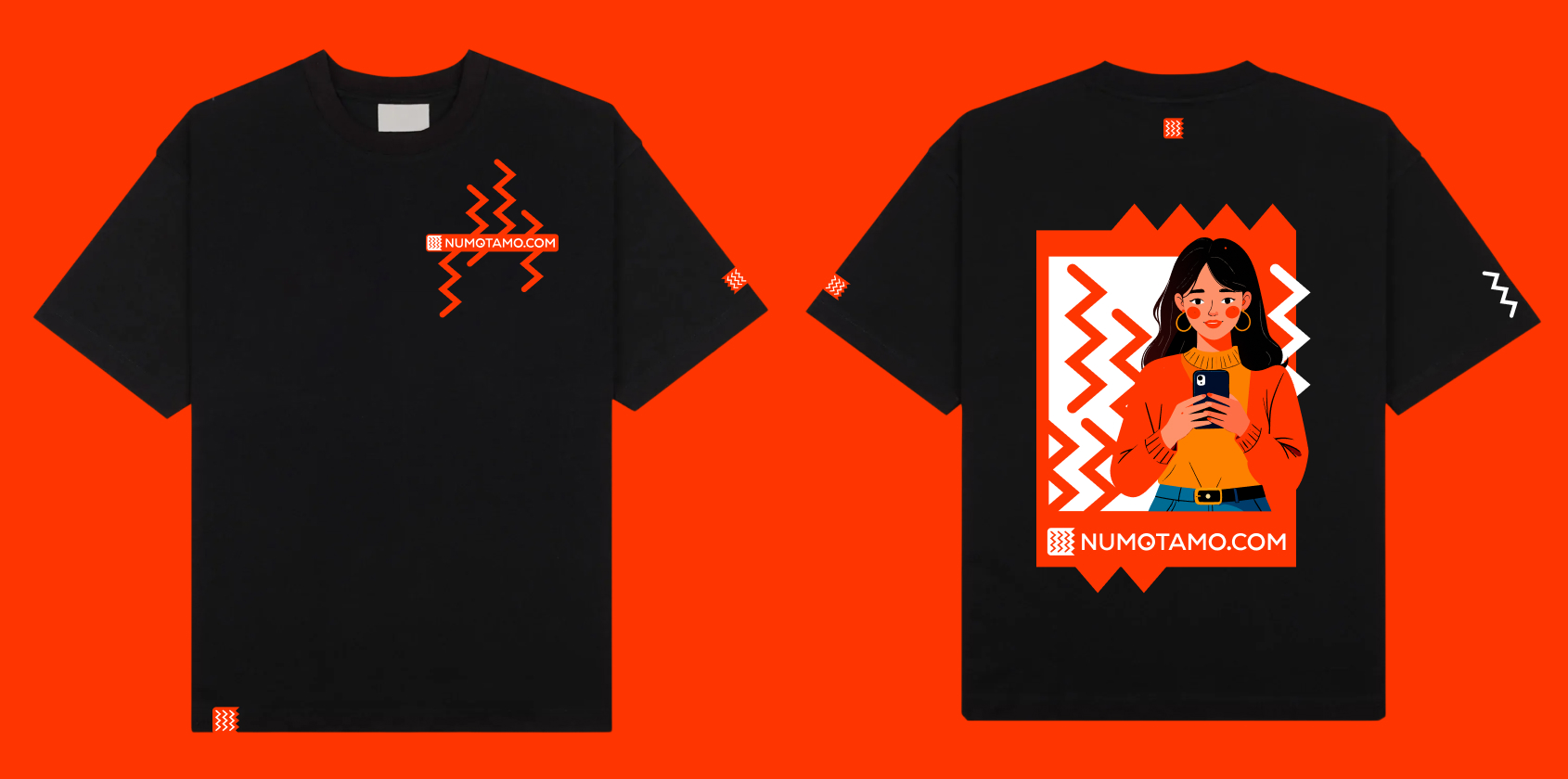
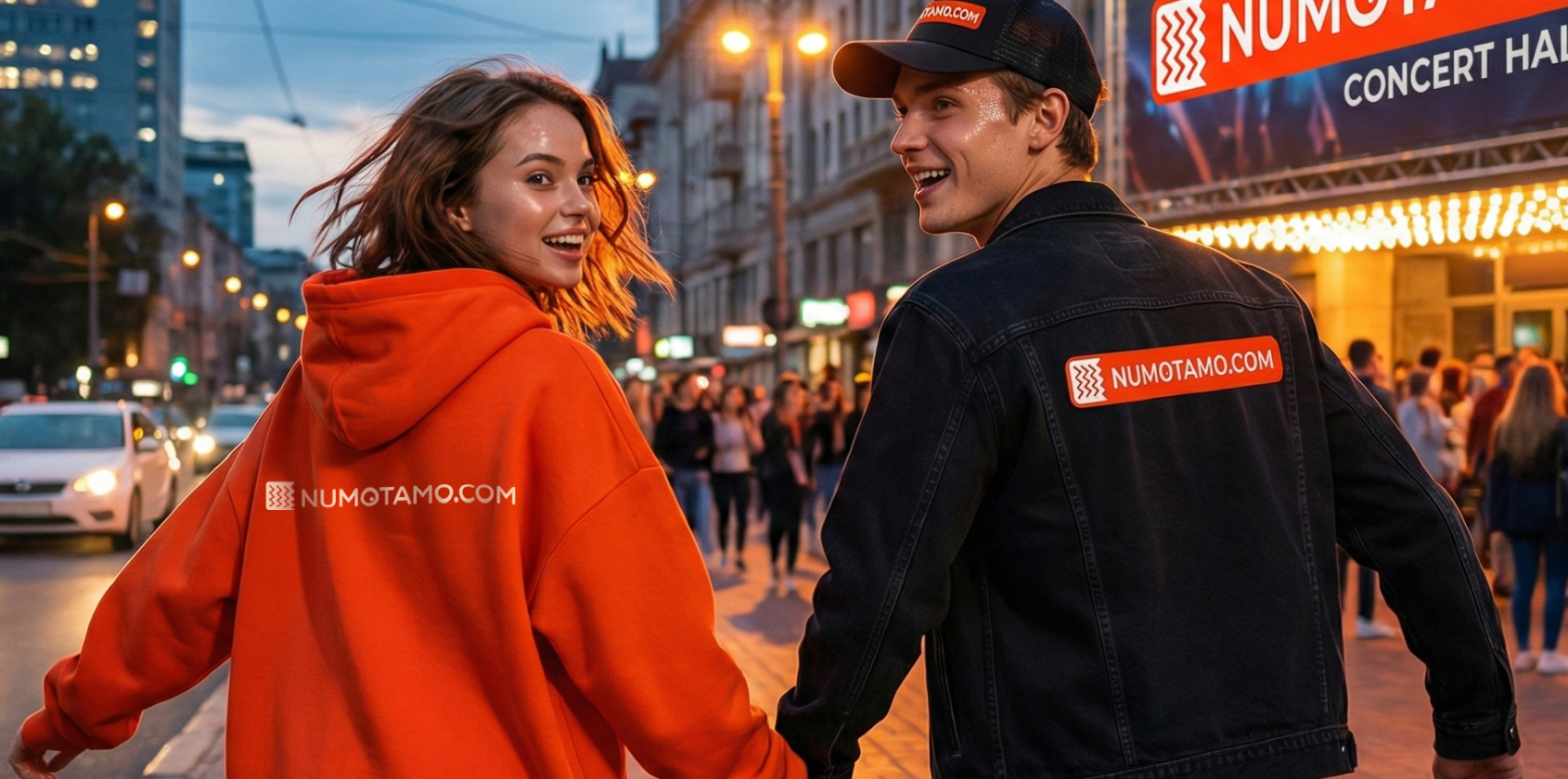
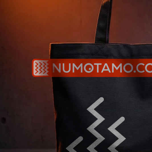
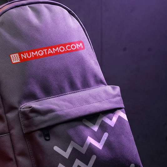
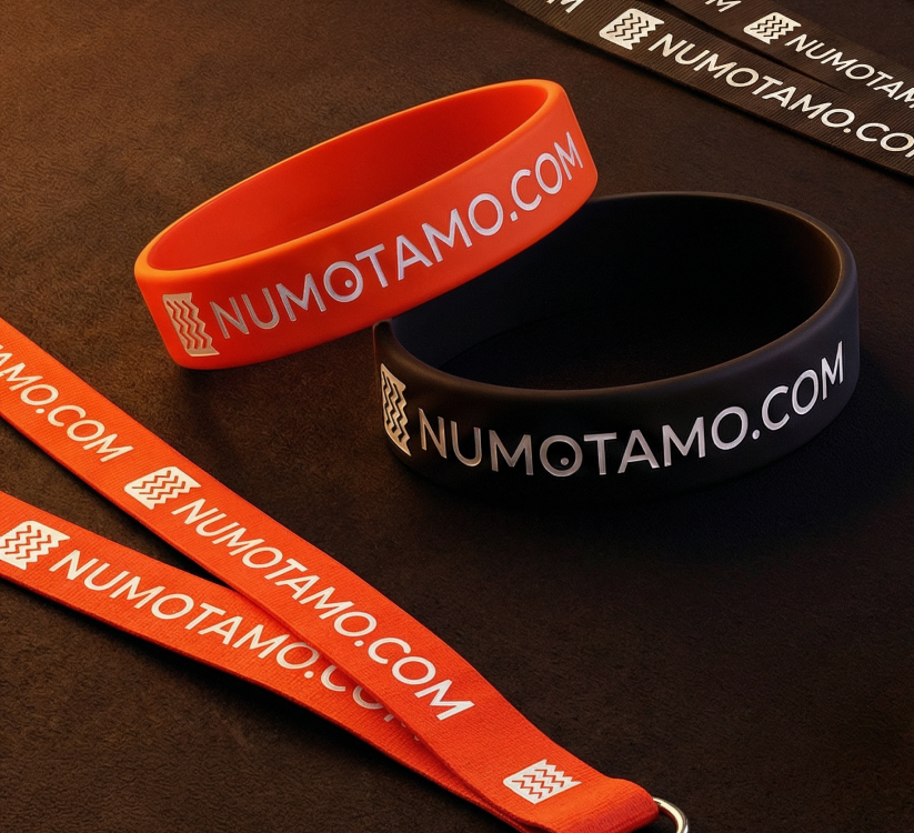
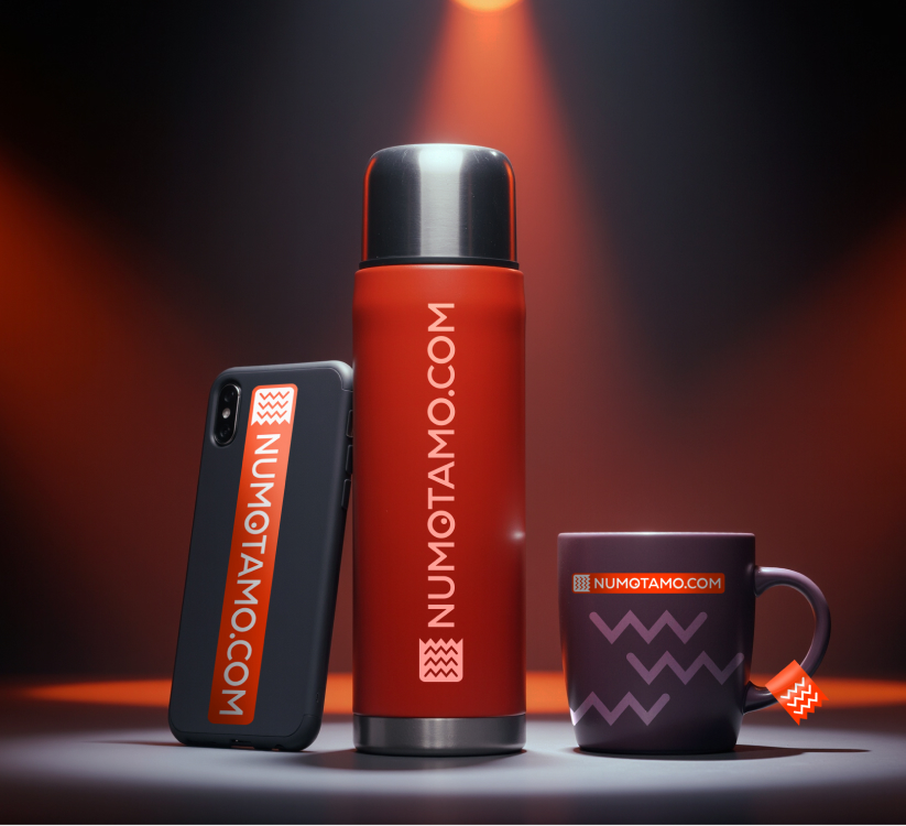
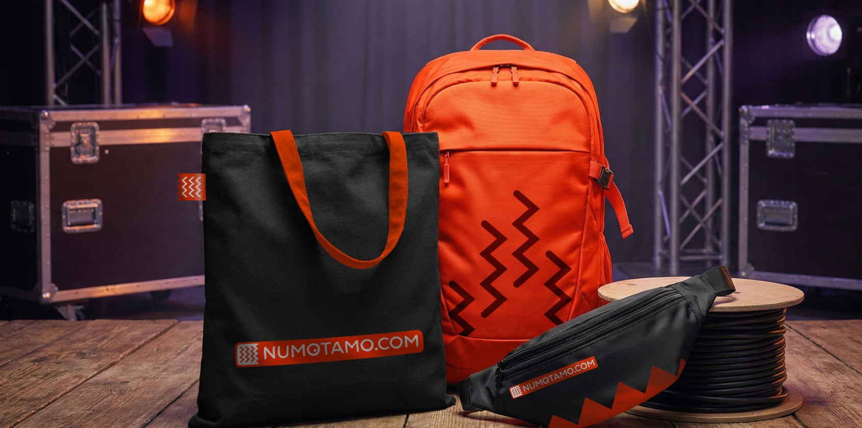
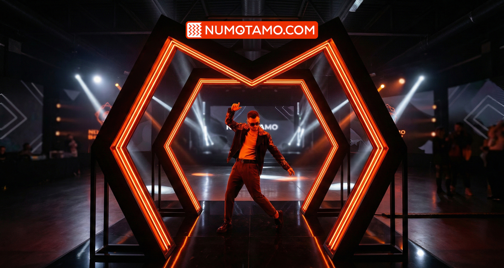
Branding From silicone ID-bracelets to sweatshirts and thermo cups — each item of merch carries a charge of “anti-everyday life”.
Collaborations Thanks to the system of “connectors”, NUMOTAMO looks organically next to services such as Spotify, Bolt or Monobank, creating a single space for relaxation.
RESULT
We created a visual language that speaks to the audience on an emotional level. Find your “Tamo” – its a call to rediscover the city, get out of the routine and become the hero of your own stories, not just a spectator of others
PROJECT TEAM
Idea, concept — Taras Gorbul, Iryna Purina Project management — Olena Russ, Iryna Purina Art director — Anna Krush Graphic design — Anna Krush Motion design — Igor Malyk
This website uses cookies so that we can provide you with the best user experience possible. Cookie information is stored in your browser and performs functions such as recognising you when you return to our website and helping our team to understand which sections of the website you find most interesting and useful.
Strictly Necessary Cookies
Strictly Necessary Cookie should be enabled at all times so that we can save your preferences for cookie settings.
If you disable this cookie, we will not be able to save your preferences. This means that every time you visit this website you will need to enable or disable cookies again.